Introduction:
Graphic design is more than just creating visually appealing images; it’s about conveying messages, eliciting emotions, and sparking engagement. However, mastering the art of graphic design requires not only creativity but also adherence to certain principles. In this blog, we’ll delve into the essential do’s and don’ts of graphic designing, guiding both aspiring designers and seasoned professionals through the intricacies of this dynamic field.
The Do’s:
Understand the Brief:
Do immerse yourself in the project brief. Understand the client’s requirements, target audience, and desired outcomes before diving into the design process. Clear communication and comprehension lay the foundation for successful design execution.
Embrace Simplicity:
Do strive for simplicity in your designs. Cluttered compositions can overwhelm viewers and dilute your message. Opt for clean layouts, minimalist aesthetics, and concise messaging to ensure clarity and impact.
Prioritize Typography:
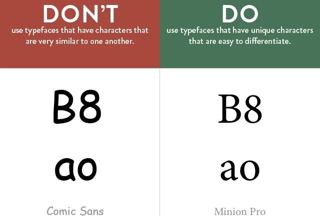
Do pay careful attention to typography. Select fonts that complement the overall design theme and enhance readability. Experiment with font pairings, sizes, and styles to create visual hierarchy and guide the viewer’s attention effectively.
Maintain Consistency:
Do maintain consistency across your design elements. From color schemes and typography to imagery and branding elements, consistency breeds professionalism and reinforces brand identity. Establish style guides to ensure uniformity in all design assets.
Embrace White Space:
Do embrace the power of white space. White space, or negative space, allows elements to breathe and enhances visual appeal. Use it strategically to create balance, highlight key content, and improve overall comprehension.
The Don’ts:
Avoid Overdesigning:
Don’t succumb to the temptation of overdesigning. Excessive use of graphics, effects, and embellishments can detract from the core message and confuse viewers. Practice restraint and prioritize clarity over extravagance.
Say No to Poor Image Quality:
Don’t compromise on image quality. Blurry, pixelated, or stretched images diminish the professionalism of your designs and erode credibility. Always use high-resolution images and vector graphics for optimal results.
Steer Clear of Copyright Infringement:
Don’t overlook copyright laws and intellectual property rights. Respect copyright restrictions when using images, illustrations, and other design elements. Seek permission or opt for royalty-free assets to avoid legal repercussions.
Don’t Ignore Feedback:
Don’t dismiss feedback from clients, colleagues, or users. Constructive criticism provides valuable insights and opportunities for improvement. Embrace feedback with an open mind and use it to refine your designs iteratively.
Avoid Ignoring Accessibility:
Don’t neglect accessibility considerations in your designs. Ensure that your designs are inclusive and accessible to individuals with disabilities. Pay attention to factors such as color contrast, font legibility, and screen reader compatibility to foster inclusivity.


